BY RHODA WILSON ON • ( 42 COMMENTS )


There is growing evidence that the SARS-CoV-2 virus was in populations before the purported date of the start of the “pandemic.” However, no excess death was reported … until the health emergency was declared.
There is extremely fine-grained daily death data available for Italy – probably the most granular data available anywhere in the world.
Assumptions derived from this data from Lombardy, Italy — including estimates of the case and infection fatality rates — formed the basis of Covid policies implemented in early 2020 first in the UK, and thereafter rippling across the world
However, using this same data for the period February – May 2020, Jonathan Engler demonstrated how the data shows it is not the spread of a virus but rather health policies, the administration of health and social care, which impacted death rates in the region.
“These observations surely raise questions which need answering around the causes of the high rates of excess deaths in the Lombardy region in spring 2020,” Engler wrote.
Below are excerpts from an article titled ‘Were the unprecedented excess deaths curves in Northern Italy in spring 2020 caused by the spread of a novel deadly virus?’ by Jonathan Engler published by PANDA Uncut. Read the full article HERE
Let’s not lose touch…Your Government and Big Tech are actively trying to censor the information reported by The Exposé to serve their own needs. Subscribe now to make sure you receive the latest uncensored news in your inbox
Follow The Exposé’s Official Channel on Telegram here
Join the conversation in our Telegram Discussion Group here
By Jonathan Engler
As pointed out in several analyses (see, by way of example, these papers reporting data from Italy, the USA, Congo and Brazil), there is growing evidence of the totally unnoticed presence of the virus prior to the purported date of the start of the pandemic and even as early as September 2019. In nearly all papers reporting such data, the significance of there being no excess death observable until the emergency is declared seems to have been missed.
It is worth considering this counterfactual: imagine there was no virus at all, but that for some other reason (any will do) governments decided to institute a range of measures including:
- Telling people not to attend healthcare if they had a cough, fever or other symptoms both to “protect” healthcare and also because any contact with healthcare would quite likely make you contract a deadly disease.
- Telling healthcare staff to isolate if they (or in some cases someone in their household) received a positive test for a certain illness, even if asymptomatic.
- Emptying beds in preparation for being “overwhelmed”.
- Terrorizing and isolating elderly people, especially those living in care homes, denying them visits from relatives and reducing or eliminating in-personal visits from health and social carers.
- Using the entire machinery of state plus all social media and legacy mainstream media channels to promote an exaggerated narrative of fear aimed at the public and spilling over into healthcare workers, when it is well established that stress has several adverse health effects, including immuno-suppression.
- Massive overuse of a treatment (ventilation) with no solid evidential basis, now known to be extremely harmful.
The implementation of such policies would result in protests in the streets with people declaring that “thousands of people will surely die”, and no doubt they would have been right. It is inconceivable that such policies would not have a significant associated mortality.
It must therefore surely be reasonable to assume that at least some of the deaths which occurred in the aftermath of the cataclysmic changes to the delivery of healthcare — especially of the frail and elderly — might have been caused by policy, rather than a virus. The question is: what proportion were caused by such policy changes, and what by the spread of a virus through the population?
The starting point in analysing this question is to ask: what is the evidence of the spread of a virus being the cause of the excess death curves observed? Is “spread” able to be measured, and what would be the implications of different findings?
A Forest Fire Analogy
Imagine a forest fire starting in one corner of a dry forest, ignited perhaps by someone leaving a smouldering barbeque lying around. It would start with a single localised cluster of burning, which would then grow and spread in tendrils until a patch of some more dry tinder was found; these areas would then catch fire, perhaps igniting nearby areas by direct contact. Occasionally a spark would fly off or a burning dead branch would fall off a tree, igniting an area slightly further away, and the process would carry on there. After a while, the whole forest would be ablaze, but only for a short time, because it would soon burn itself out, but with various areas going out at different times because the fires did not start in those areas at the same times.
That would be what you’d expect to see when a process spreads from a point source. What you would NOT expect to see would be the entire forest catching fire at the same time and all areas burning themselves out simultaneously. If that happened, most people would assume that something which affected the entire area at the same time — and which did not rely on spread at all — had happened, maybe a huge destructive fireball from a nearby explosion.
One key point in relation to this is that surveying the scene after the event does not really help that much in determining the cause. They look similar in both scenarios — a burnt-out forest. You need to look at a time series, i.e., how the different areas were affected over time, to find the conclusive evidence of spread.
Does Lombardy Look Like a Spread of a Virus?
[Keeping the forest fire analogy in mind] take a look again at the all-cause death curves in the 13 administrative areas (hereafter termed “provinces” or “administrative areas”) forming the region of Lombardy.
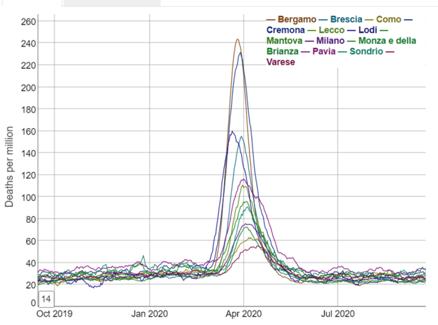
These are not what you would expect at all from spread. Close analysis reveals that the excess death curves for Lodi appear to start around 23 Feb and for all the other areas this happens on or within just a few days of 1 March.
But can this be demonstrated more mathematically? Yes.
The characteristic we are looking at here is excess death – a much better one than counting deaths labelled as “covid deaths.” As pointed out in the Lombardy analysis, we are fortunate that extremely fine-grained daily death data is available for Italy; in fact, this is probably the most granular data available anywhere in the world, showing daily deaths occurring in relatively small areas across Italy.
So, what does this more fine-grained analysis show?
Below depicts the numbers of people dying from all causes across Northern Italy (which includes Lombardy) in February.
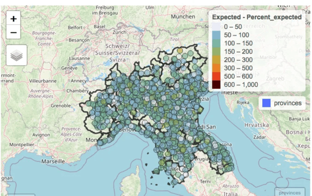
The numbers of deaths in each municipality with a population large enough to provide meaningful data (of which there are several hundred in Northern Italy) have been colour-coded according to the numbers of deaths in the month of February compared to the average number observed over the previous 5 years.
The notable observation is that as would be expected in the absence of a pandemic, some areas have deaths a little below “expected” (light blue or grey), some a little above (green or yellow). But the key point is that there are no clusters at all.
Both the lack of excess deaths overall and the lack of clusters of excess deaths are in fact totally unexpected in light of the evidence — now supported by papers studying antibodies and PCR testing data AND symptoms — of significant presence of SARS-CoV-2 in February (and earlier, in fact).
How could an apparently highly contagious and lethal virus have spread throughout the region so much that case growth was apparently actually slowing* in most areas by the end of February, without leaving any signal of increased deaths in its wake?
[*Note: See the image of the estimated reproduction rate in the original article not included here]
So how about March — the month of the shocking excess death curves?
Here’s the map for March:
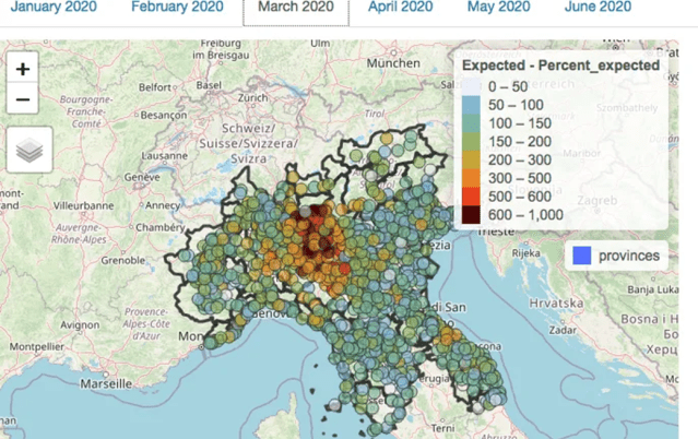
At first glance, there is visible clustering, so you would be forgiven for thinking that this represents evidence of viral spread. A statistical analysis for auto-correlation also suggests spread.
However, it is important to realise that auto-correlation can have causes other than biological spread. Each municipality is located within an individual province; differences between these provinces in the administration of health and social care which impacted death rates would also result in the appearance of clustering. However, this is not due to the spread of a virus but rather due to the similarities between neighbouring municipalities in healthcare policy due to being in the same administrative area.
By fitting a model with 2 components — firstly the administrative province in which the municipality is located, and secondly the death rates in neighbouring municipalities — the effects of province and neighbouring municipality can be analysed separately.
This is what the picture in March looks like when the effect of provincial location has been subtracted mathematically:

The clustering nearly entirely disappears when provincial borders are taken into account (and the statistical analysis confirms this).
On the assumption that healthcare is organised by province, the conclusion can only be that it was the manner in which healthcare was delivered which was relevant to the death rate, not the spread of a virus, which would of course have no respect for provincial boundaries.
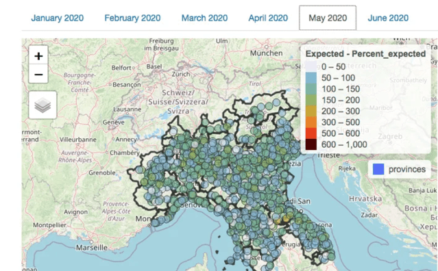
What happened when excess deaths later declined?
Recall that above I suggested that as the fire in the forest burned out, clusters would die out over a period of time as they started at different times. You would not expect all the fires to go out across the forest at the same time.
Yet the fires did all go out more or less simultaneously in Lombardy. There is a collapse in both excess deaths and any spatial pattern in May.
Conclusion and closing remarks
Statistical analysis of auto-correlation of excess deaths in Lombardy in spring 2020 reveals much less clustering than would be expected if a virus spreading across the region was responsible. What small amount of clustering is observed appears to be more related to differences between the administrative regions in which the municipalities are located.
These observations surely raise questions which need answering around the causes of the high rates of excess deaths in the Lombardy region in spring 2020.
The fact that assumptions derived from the data from Lombardy — including estimates of the case and infection fatality rates — formed the basis of policies implemented first in the UK, and thereafter rippling across the world, makes this a question which should be addressed with some urgency.
This is especially the case since these policies are now being recognised as having caused catastrophic long-lasting harm to much of the world’s population with little or no discernible benefit.
[As an article recently published in the BMJ by a group of Italian scientists suggests, what is there to lose in accepting the hypothesis of the 2019 spread of SARS-CoV-2 as tenable and exploring it urgently?]
What there is to lose — at least for those who have relentlessly pushed a single narrative explanation for all observations since 2020, censoring any alternative viewpoints with the use of the oxymoron “the science is settled” — is the realisation by citizens that a large proportion of deaths may have been wrongly ascribed to a virus rather than to their true cause — the nature of the response to the perceived threat of a virus.
Featured image: This Overlooked Variable Is the Key to the Pandemic, The Atlantic, 30 September 2020
_______________________________
A unified pushback against the globalist agenda
It’s finally here, the Global Walkout begins September 4th at 8pm London time and continue every weeks. Next step october 2nd.
One step at a time, hand in hand, we are walking out from the globalist society they are trying to enslave us into
ANYONE can participate
ANYWHERE in the world
JOIN or read about it here – https://globalwalkout.com

https://www.reignitefreedom.com/
The third step is to unsubscribe from all mainstream media outlets. Delete the apps from your phone, laptop, and tablet and unfollow all of their social media and YouTube channels. Try to avoid mainstream media for at least one week, even if the headline is intriguing.
In the same time why not removing all the big tech tracking/spying/social credit system around you: (Youtube, Facebook, Instagram, Twitter, Tik Tok, Google, Apple, Microsoft, Whatsapp, Zoom, Linkedln, Snapchat, Tumblr, Pinterest, Reddit, Myspace, etc.)
The fourth step of the global walkout is to move as many accounts as you can to a union or local bank.
If you like our work please consider to donate :
_______________________________
If you are looking for solutions (lawyer, form, gathering, action, antidote, treatments, maybe this could help you:
HERE
If you want to fight back better:
https://childrenshealthdefense.org/child-health-topics/health-freedom/defender-days-sticker-gallery/
Find the others: www.freedomcells.org
Spike Protein Protocol
Glutathione (most important for body detoxification) or better
NAC = N-Acetyl-Cysteine 600-750mg (causes the body to produce glutathione itself)
Zinc
Astaxantin 5mg (also improves vision)
Quercetin
vitamin D3
Milk thistle (also liver and stomach protection)
Melatonin 1mg to 10mg (against 5G)
Alternatively CDS/CDL and zeolite
Dr. Zelenko’s Protocol contains Ivermectin, Hydroxychloroquine (HCQ), Zinc, Vitamin D3, and Quercetin.
How to find the truth :
Search engine: https://metager.org/ https://presearch.org/ or https://search.brave.com/
Videos: www.brandnewtube.com
www.odysee.com
www.bitchute.com
Facebook style: www.gab.com
Related posts:
Views: 0
 RSS Feed


 September 27th, 2022
  Awake Goy

 Posted in
  Tags:
Tags: 

